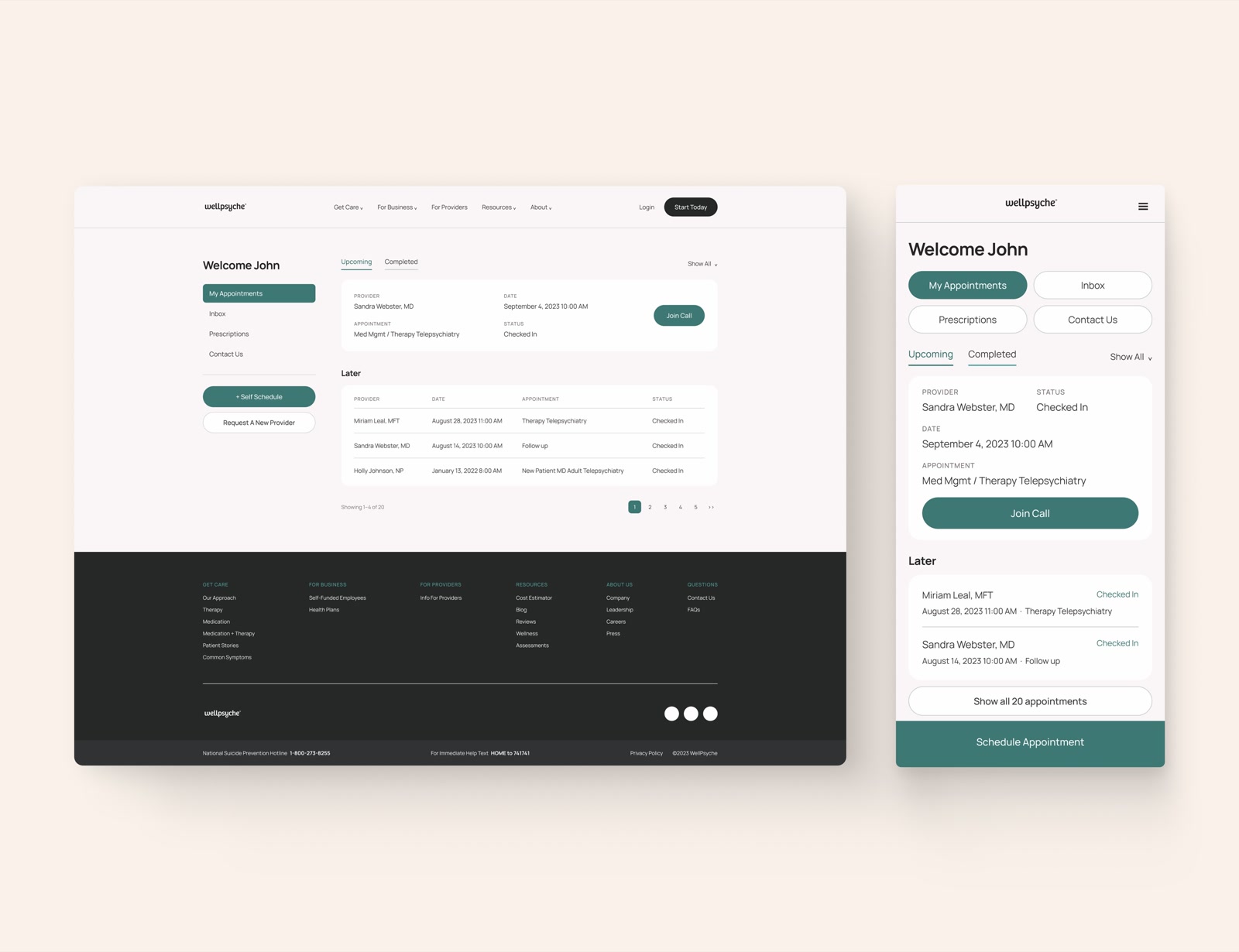
A desktop portal that most people opened on a phone. Abandonment went from 55% to 18%.
WellPsyche is a therapy and psychiatry practice. The patient portal was outdated, hard-coded, and desktop only. Most patients were on phones. We redesigned the portal for mobile which led to an increase in user enrollment.
Enrollment took over 15 minutes. More than 60% of people quit partway through it. 58% couldn’t find the option to book more than one appointment. And there was no way to message a provider at all, so most patients ended up telling their psychologist about their pain points.
Before starting anything I ran a heuristic analysis. Three options came out of it: refresh the visuals, cut enrollment fields, and build the layout for mobile. Based on analytics I made the case to prioritize mobile since the majority of patients used their phones to access the portal.
I started with low fidelity wireframes to test a new onboarding flow. The early ones failed. Onboarding a patient means a lot of medical and legal questions that have to be asked, and the problem was getting people through them without it feeling like an interrogation. Five iterations to get there.
Mobile onboarding abandonment dropped from 55% to 18%. Task success on booking multiple appointments went from 50% to 90%. 92% of testers said the look and the ease of use were better. Every one of those abandoned enrollments had been a phone call to the office, or a patient who just left.
WellPsyche is a therapy and psychiatry practice. The patient portal was five years old, hard-coded, and desktop only.
The company had just rebranded and wanted the portal to match. That’s what paid for the project. But a rebuild was never on the table and we had three months, so the only useful question was which parts were measurably broken and which of those we could actually reach.
Enrollment took over 15 minutes. More than 60% of people quit partway through it. 58% couldn’t find the option to book more than one appointment. And there was no way to message a provider at all, so most patients ended up telling their psychologist about their pain points.
Before starting anything I ran a heuristic analysis. Three options came out of it: refresh the visuals, cut enrollment fields, and build the layout for mobile. Based on analytics I made the case to prioritize mobile since the majority of patients used their phones to access the portal.
Our initial research phase covered two flows end to end: enrollment and appointment scheduling. Every defect got a severity rating and a note on whether it was layout, content, or something that needed engineering.
What it found:
- Enrollment took more than 15 minutes. Over 60% of users abandoned it.
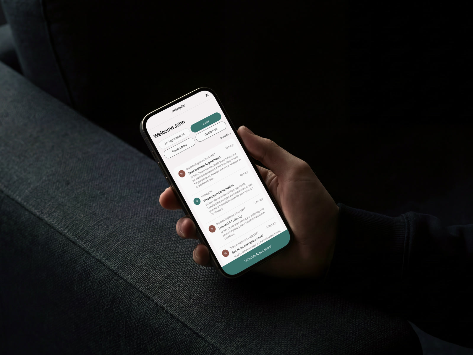
- No option to contact a provider anywhere in the portal.
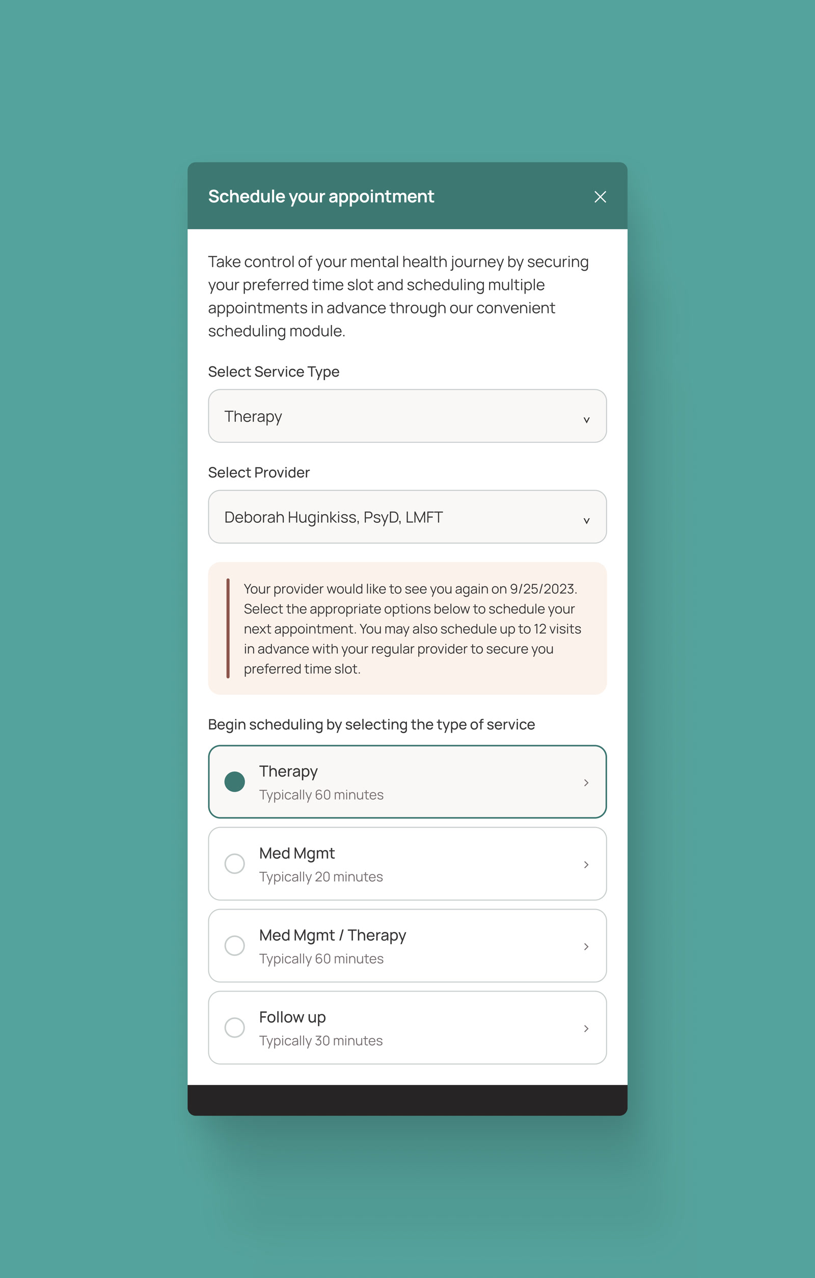
- 58% of users couldn’t work out how to schedule more than one appointment.
- Mobile was hard to navigate and nothing had been optimized for it.
- No way to manage multiple accounts, which mattered for a parent booking for a child.
- Registration was inconsistent from page to page.
I started with initial low fidelity wireframes to test a new onboarding flow. A couple of early iterations failed because when onboarding new patients, there are a lot of medical questions and legal questions that must be asked to the patients. This meant finding a way for us to get the user to fill out forms without it feeling like they were being interrogated. This turned out to be a bigger problem to solve than we initially planned for. After 5 iterations we were able to solve for most of what was needed.
What changed:
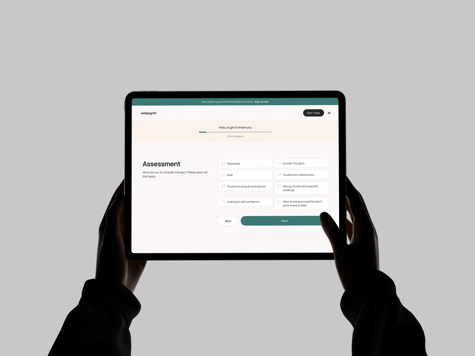
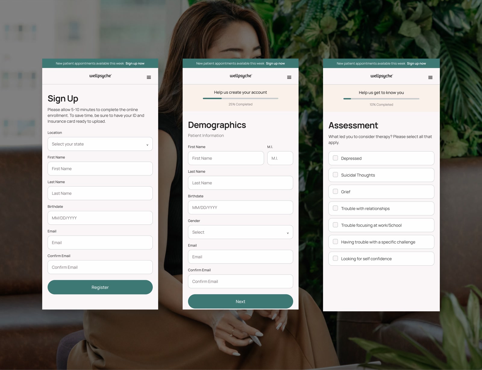
- Progress moved to a strip at the top with a percentage. Same steps, visible cost.
- First, middle initial and last share a row on desktop and tablet, and stack on mobile. The middle initial stopped being a full-width input.
- The assessment checklist went from one narrow column to a two-column grid on bigger screens, so all eight options fit without scrolling.
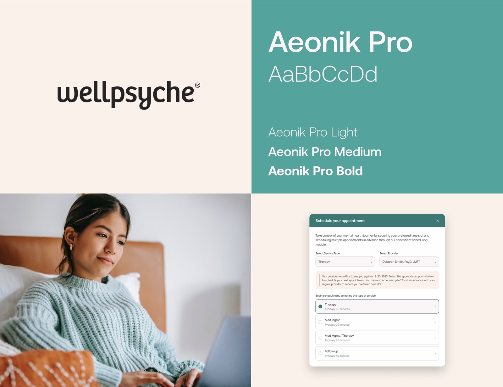
Booking multiple appointments worked fine, but 58% of users couldn’t find it. It sat behind a service-type dropdown with nothing to suggest booking ahead was possible. The rebuilt panel says it plainly and puts service, provider and the recurring option in one view.
Contacting a provider had no entry point at all, so patients called the office. Inbox gave it somewhere to live: provider messages, prescription confirmations, appointment notes, one list.