Helping users plan and manage travel with an all-in-one app.
UX Design, Mobile App, Branding
CATEGORY
UX Designer
ROLE
BRIEF
Traveling can be stressful. Deciding where to go and making sure you have all your documents can be a stressful task. We needed a way to help users manage their travel plans so that they can have peace of mind and focus on enjoying their vacation rather than managing them.
I gathered qualitative data and talked to frequent travelers to help them understand the pain points they experience while getting ready to go on a trip. Using that info I created a strategy for a mobile app that would help users manage their travel plans and remove the stress of planning a vacation.
WHAT WE DID
-
Booking was easy and intuitive for users.
-
Managing travel was a feature that users liked.
-
82% satisfaction rate for the overall experience of the app.
HIGHLIGHTS

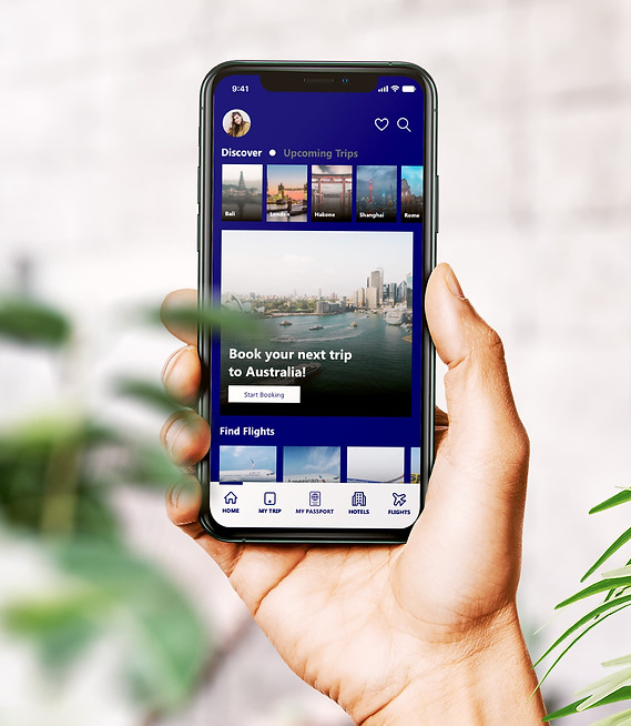

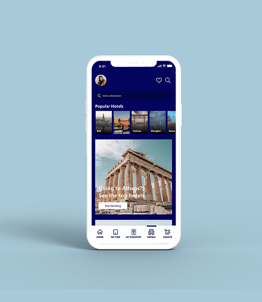

DISCOVER + DEFINE
Stressful times while planning that getaway
Traveling is often hectic and tiring, especially during the planning phase and organizing necessary documents. Even experienced travelers can feel stressed ensuring they've booked everything and managing various apps for dates and documents can be a hassle.
Goals
-
Reduce friction when traveling through the airport.
-
Manage multiple travelers
-
Help users discover new places to travel
-
Help users convert currency
Planning for travel is a long process and requires users to manage a lot of documentation. This creates stress and might take the fun away from going on vacation.
Problem Statement
How might we help users streamline travel planning and also enable them to search, plan, and manage all aspects of their travels seamlessly?
How might we
DISCOVERY + DEFINE
I started with user interviews to grasp users' sentiments about travel. Engaging with 20 individuals provided insights into their behaviors, attitudes, and travel-related challenges.
User Research


Q: What are some things that stress you out about traveling?
Q: How far in advance do you plan your travel?
DISCOVERY + DEFINE
Prior to diving into design work, I utilized existing research to perform a SWOT analysis, comparing my app to competitors. This step aimed to identify weaknesses and opportunities within my app, guiding adjustments in the design phase.
Studying the competition

Swot analysis created using Miro
DISCOVERY + DEFINE
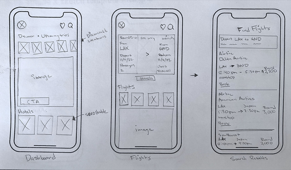
Sketches before the screens


DESIGN SYSTEM
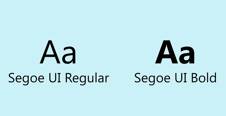
The inspiration for the brand came from photographs of airports and skies that I looked at. Wanting to replicate the feel of traveling in the sky I used a color palette that represented different shades of the skies all over the world. I picked imagery that was cool in tone with a professional tone.
Creating the visual system






TESTING & REFLECTION
Gathering Feedback from Users
Once hi-fidelity wireframes were concluded, I tested the wireframes with a small group of users, The feedback was mostly positive but there were some opportunities for improvement that came from testing;
-
Users stated to wanting to be able to book trips as a group.
-
Potential Solution: Introduce a feature allowing for users to plan trips as a group rather than individually.
-
-
Some users wanted to see activities or more information about destinations.
-
Potential Solution: Include information in the user-flow about destinations and the ability to book activities to the users' itineraries.
-
-
Users stated they weren't sure if they wanted to keep their private information on the app.
-
Potential Solution: add additional context for users so they can learn about how their information gets stored on the app.
-
-
Some users asked if there were any rewards for booking through the app.
-
Potential Solution: Do more research on a rewards system and implement one to reward users for using the app.
-


TESTING & REFLECTION
Recapping the Process
As I wrapped the project up I did a reflection on the takeaways from the project and what the next steps were for it. Below are some of the things I came away with.
-
The SWOT analysis I conducted allowed me to understand where the gaps in my app were and therefore allowed me to plan for what features were vital to the user experience.
-
During the user interviews, the questions that got users to think about their answers were questions that were open-ended. This was important because the answers were unbiased but also made users think about their experiences rather than just answer the questions on impulse.
-
During the ideate phase, the feedback I received from sketching the screens first was vital to my process because it allowed me to validate my design choices before moving on to high fidelity. Although users don't perceive user experiences as sketches or in black and white it was important to gather feedback early on because it forced the user to focus their feedback on functionality rather than color and images.
